Android UI
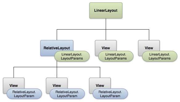
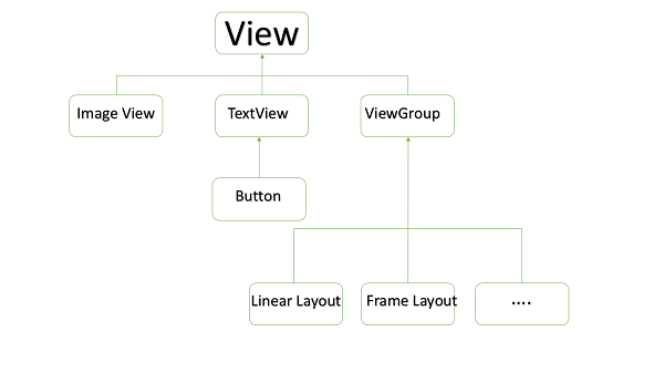
The basic building block for user interface is a View object which is created from the View class and occupies a rectangular area on the screen and is responsible for drawing and event handling. View is the base class for widgets, which are used to create interactive UI components like buttons, text fields, etc.
The ViewGroup is a subclass of View and provides invisible container that hold other Views or other ViewGroups and define their layout properties.
At third level we have different layouts which are subclasses of ViewGroup class and a typical layout defines the visual structure for an Android user interface and can be created either at run time using View/ViewGroup objects or you can declare your layout using simple XML file main_layout.xml which is located in the res/layout folder of your project.
LAYOUT PARAMS
This tutorial is more about creating your GUI based on layouts defined in XML file. A layout may contain any type of widgets such as buttons, labels, textboxes, and so on. Following is a simple example of XML file having LinearLayout:
<?xml version="1.0" encoding="utf-8"?>
<LinearLayout xmlns:android="http://schemas.android.com/apk/res/android"
   android:layout_width="fill_parent"
   android:layout_height="fill_parent"
   android:orientation="vertical" >

   <TextView android:id="@+id/text"
      android:layout_width="wrap_content"
      android:layout_height="wrap_content"
      android:text="This is a TextView" />

   <Button android:id="@+id/button"
      android:layout_width="wrap_content"
      android:layout_height="wrap_content"
      android:text="This is a Button" />

   <!-- More GUI components go here  -->

</LinearLayout>
Once your layout has created, you can load the layout resource from your application code, in your Activity.onCreate() callback implementation as shown below −
public void onCreate(Bundle savedInstanceState) {
   super.onCreate(savedInstanceState);
   setContentView(R.layout.activity_main);
}
Android Layout Types
There are number of Layouts provided by Android which you will use in almost all the Android applications to provide different view, look and feel.
| Sr.No | Layout & Description |
|---|---|
| 1 |
LinearLayout is a view group that aligns all children in a single direction, vertically or horizontally.
|
| 2 |
RelativeLayout is a view group that displays child views in relative positions.
|
| 3 |
TableLayout is a view that groups views into rows and columns.
|
| 4 |
AbsoluteLayout enables you to specify the exact location of its children.
|
| 5 |
The FrameLayout is a placeholder on screen that you can use to display a single view.
|
| 6 |
ListView is a view group that displays a list of scrollable items.
|
| 7 |
GridView is a ViewGroup that displays items in a two-dimensional, scrollable grid.
|
Layout Attributes
Each layout has a set of attributes which define the visual properties of that layout. There are few common attributes among all the layouts and their are other attributes which are specific to that layout. Following are common attributes and will be applied to all the layouts:
| Attribute | Description |
|---|---|
| android:id | This is the ID which uniquely identifies the view. |
| android:layout_width | This is the width of the layout. |
| android:layout_height | This is the height of the layout |
| android:layout_marginTop | This is the extra space on the top side of the layout. |
| android:layout_marginBottom | This is the extra space on the bottom side of the layout. |
| android:layout_marginLeft | This is the extra space on the left side of the layout. |
| android:layout_marginRight | This is the extra space on the right side of the layout. |
| android:layout_gravity | This specifies how child Views are positioned. |
| android:layout_weight | This specifies how much of the extra space in the layout should be allocated to the View. |
| android:layout_x | This specifies the x-coordinate of the layout. |
| android:layout_y | This specifies the y-coordinate of the layout. |
| android:layout_width | This is the width of the layout. |
| android:layout_width | This is the width of the layout. |
| android:paddingLeft | This is the left padding filled for the layout. |
| android:paddingRight | This is the right padding filled for the layout. |
| android:paddingTop | This is the top padding filled for the layout. |
| android:paddingBottom | This is the bottom padding filled for the layout. |
Here width and height are the dimension of the layout/view which can be specified in terms of dp (Density-independent Pixels), sp ( Scale-independent Pixels), pt ( Points which is 1/72 of an inch), px( Pixels), mm ( Millimeters) and finally in (inches).
You can specify width and height with exact measurements but more often, you will use one of these constants to set the width or height −
- android:layout_width=wrap_content tells your view to size itself to the dimensions required by its content.
- android:layout_width=fill_parent tells your view to become as big as its parent view.
Gravity attribute plays important role in positioning the view object and it can take one or more (separated by '|') of the following constant values.
| Constant | Value | Description |
|---|---|---|
| top | 0x30 | Push object to the top of its container, not changing its size. |
| bottom | 0x50 | Push object to the bottom of its container, not changing its size. |
| left | 0x03 | Push object to the left of its container, not changing its size. |
| right | 0x05 | Push object to the right of its container, not changing its size. |
| center_vertical | 0x10 | Place object in the vertical center of its container, not changing its size. |
| fill_vertical | 0x70 | Grow the vertical size of the object if needed so it completely fills its container. |
| center_horizontal | 0x01 | Place object in the horizontal center of its container, not changing its size. |
| fill_horizontal | 0x07 | Grow the horizontal size of the object if needed so it completely fills its container. |
| center | 0x11 | Place the object in the center of its container in both the vertical and horizontal axis, not changing its size. |
| fill | 0x77 | Grow the horizontal and vertical size of the object if needed so it completely fills its container. |
| clip_vertical | 0x80 | Additional option that can be set to have the top and/or bottom edges of the child clipped to its container's bounds. The clip will be based on the vertical gravity: a top gravity will clip the bottom edge, a bottom gravity will clip the top edge, and neither will clip both edges. |
| clip_horizontal | 0x08 | Additional option that can be set to have the left and/or right edges of the child clipped to its container's bounds. The clip will be based on the horizontal gravity: a left gravity will clip the right edge, a right gravity will clip the left edge, and neither will clip both edges. |
| start | 0x00800003 | Push object to the beginning of its container, not changing its size. |
| end | 0x00800005 | Push object to the end of its container, not changing its size. |
View Identification
A view object may have a unique ID assigned to it which will identify the View uniquely within the tree. The syntax for an ID, inside an XML tag is −
android:id="@+id/my_button"
Following is a brief description of @ and + signs −
- The at-symbol (@) at the beginning of the string indicates that the XML parser should parse and expand the rest of the ID string and identify it as an ID resource.
- The plus-symbol (+) means that this is a new resource name that must be created and added to our resources. To create an instance of the view object and capture it from the layout, use the following −
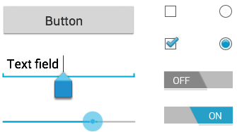
Input controls are the interactive components in your app's user interface. Android provides a wide variety of controls you can use in your UI, such as buttons, text fields, seek bars, check box, zoom buttons, toggle buttons, and many more.
UI ELEMENTS
A View is an object that draws something on the screen that the user can interact with and a ViewGroup is an object that holds other View (and ViewGroup) objects in order to define the layout of the user interface.
You define your layout in an XML file which offers a human-readable structure for the layout, similar to HTML. For example, a simple vertical layout with a text view and a button looks like this −
<?xml version="1.0" encoding="utf-8"?>
<LinearLayout xmlns:android="http://schemas.android.com/apk/res/android"
   android:layout_width="fill_parent"
   android:layout_height="fill_parent"
   android:orientation="vertical" >

   <TextView android:id="@+id/text"
      android:layout_width="wrap_content"
      android:layout_height="wrap_content"
      android:text="I am a TextView" />

   <Button android:id="@+id/button"
      android:layout_width="wrap_content"
      android:layout_height="wrap_content"
      android:text="I am a Button" />
</LinearLayout>
Android UI Controls
There are number of UI controls provided by Android that allow you to build the graphical user interface for your app.
| S.N. | UI Control & Description |
|---|---|
| 1 | TextView
This control is used to display text to the user.
|
| 2 | EditText
EditText is a predefined subclass of TextView that includes rich editing capabilities.
|
| 3 | AutoCompleteTextView
The AutoCompleteTextView is a view that is similar to EditText, except that it shows a list of completion suggestions automatically while the user is typing.
|
| 4 | Button
A push-button that can be pressed, or clicked, by the user to perform an action.
|
| 5 | ImageButton
AbsoluteLayout enables you to specify the exact location of its children.
|
| 6 | CheckBox
An on/off switch that can be toggled by the user. You should use check box when presenting users with a group of selectable options that are not mutually exclusive.
|
| 7 | ToggleButton
An on/off button with a light indicator.
|
| 8 | RadioButton
The RadioButton has two states: either checked or unchecked.
|
| 9 | RadioGroup
A RadioGroup is used to group together one or more RadioButtons.
|
| 10 | ProgressBar
The ProgressBar view provides visual feedback about some ongoing tasks, such as when you are performing a task in the background.
|
| 11 | Spinner
A drop-down list that allows users to select one value from a set.
|
| 12 | TimePicker
The TimePicker view enables users to select a time of the day, in either 24-hour mode or AM/PM mode.
|
| 13 | DatePicker
The DatePicker view enables users to select a date of the day.
|
Create UI Controls
Input controls are the interactive components in your app's user interface. Android provides a wide variety of controls you can use in your UI, such as buttons, text fields, seek bars, check box, zoom buttons, toggle buttons, and many more.
As explained in previous chapter, a view object may have a unique ID assigned to it which will identify the View uniquely within the tree. The syntax for an ID, inside an XML tag is −
android:id="@+id/text_id"
To create a UI Control/View/Widget you will have to define a view/widget in the layout file and assign it a unique ID as follows −
<?xml version="1.0" encoding="utf-8"?>
<LinearLayout xmlns:android="http://schemas.android.com/apk/res/android"
   android:layout_width="fill_parent"
   android:layout_height="fill_parent"
   android:orientation="vertical" >

   <TextView android:id="@+id/text_id"
      android:layout_width="wrap_content"
      android:layout_height="wrap_content"
      android:text="I am a TextView" />
</LinearLayout>
Then finally create an instance of the Control object and capture it from the layout, use the following −
TextView myText = (TextView) findViewById(R.id.text_id);
Events are a useful way to collect data about a user's interaction with interactive components of Applications. Like button presses or screen touch etc. The Android framework maintains an event queue as first-in, first-out (FIFO) basis. You can capture these events in your program and take appropriate action as per requirements.
There are following three concepts related to Android Event Management −
- Event Listeners − An event listener is an interface in the View class that contains a single callback method. These methods will be called by the Android framework when the View to which the listener has been registered is triggered by user interaction with the item in the UI.
- Event Listeners Registration − Event Registration is the process by which an Event Handler gets registered with an Event Listener so that the handler is called when the Event Listener fires the event.
- Event Handlers − When an event happens and we have registered and event listener for the event, the event listener calls the Event Handlers, which is the method that actually handles the event.
Event Listeners & Event Handlers
| Event Handler | Event Listener & Description |
|---|---|
| onClick() | OnClickListener()
This is called when the user either clicks or touches or focuses upon any widget like button, text, image etc. You will use onClick() event handler to handle such event.
|
| onLongClick() | OnLongClickListener()
This is called when the user either clicks or touches or focuses upon any widget like button, text, image etc. for one or more seconds. You will use onLongClick() event handler to handle such event.
|
| onFocusChange() | OnFocusChangeListener()
This is called when the widget looses its focus i.e. user goes away from the view item. You will use onFocusChange() event handler to handle such event.
|
| onKey() | OnFocusChangeListener()
This is called when the user is focused on the item and presses or releases a hardware key on the device. You will use onKey() event handler to handle such event.
|
| onTouch() | OnTouchListener()
This is called when the user presses the key, releases the key, or any movement gesture on the screen. You will use onTouch() event handler to handle such event.
|
| onMenuItemClick() | OnMenuItemClickListener()
This is called when the user selects a menu item. You will use onMenuItemClick() event handler to handle such event.
|
| onCreateContextMenu() | onCreateContextMenuItemListener()
This is called when the context menu is being built(as the result of a sustained "long click)
|
There are many more event listeners available as a part of View class like OnHoverListener, OnDragListener etc which may be needed for your application. So I recommend to refer official documentation for Android application development in case you are going to develop a sophisticated apps.
Event Listeners Registration
Event Registration is the process by which an Event Handler gets registered with an Event Listener so that the handler is called when the Event Listener fires the event. Though there are several tricky ways to register your event listener for any event, but I'm going to list down only top 3 ways, out of which you can use any of them based on the situation.
- Using an Anonymous Inner Class
- Activity class implements the Listener interface.
- Using Layout file activity_main.xml to specify event handler directly.
Below section will provide you detailed examples on all the three scenarios −
Touch Mode
Users can interact with their devices by using hardware keys or buttons or touching the screen.Touching the screen puts the device into touch mode. The user can then interact with it by touching the on-screen virtual buttons, images, etc.You can check if the device is in touch mode by calling the View classes is in TouchMode() method.
TOUCH EVENT
Focus
A view or widget is usually highlighted or displays a flashing cursor when it is in focus. This indicates ready to accept input from the user.
- isFocusable() – it returns true or false
- isFocusableInTouchMode() – checks to see if the view is focusable in touch mode. (A view may be focusable when using a hardware key but not when the device is in touch mode)
android:foucsUp="@=id/button_l"
onTouchEvent()
public boolean onTouchEvent(motionEvent event){
   switch(event.getAction()){
      case TOUCH_DOWN:
      Toast.makeText(this,"you have clicked down Touch button",Toast.LENTH_LONG).show();
      break();

      case TOUCH_UP:
      Toast.makeText(this,"you have clicked up touch button",Toast.LENTH_LONG).show();
      break;

      case TOUCH_MOVE:
      Toast.makeText(this,"you have clicked move touch button"Toast.LENTH_LONG).show();
      break;
   }
   return super.onTouchEvent(event) ;
}
Event Handling Examples
Event Listeners Registration Using an Anonymous Inner Class
Here you will create an anonymous implementation of the listener and will be useful if each class is applied to a single control only and you have advantage to pass arguments to event handler. In this approach event handler methods can access private data of Activity. No reference is needed to call to Activity.
But if you applied the handler to more than one control, you would have to cut and paste the code for the handler and if the code for the handler is long, it makes the code harder to maintain.
Following are the simple steps to show how we will make use of separate Listener class to register and capture click event. Similar way you can implement your listener for any other required event type.
| Step | Description |
|---|---|
| 1 | You will use Android studio IDE to create an Android application and name it asmyapplication under a package com.example.myapplication as explained in theHello World Example chapter. |
| 2 | Modify src/MainActivity.java file to add click event listeners and handlers for the two buttons defined. |
| 3 | Modify the default content of res/layout/activity_main.xml file to include Android UI controls. |
| 4 | No need to declare default string constants.Android studio takes care default constants. |
| 5 | Run the application to launch Android emulator and verify the result of the changes done in the application. |
Following is the content of the modified main activity filesrc/com.example.myapplication/MainActivity.java. This file can include each of the fundamental lifecycle methods.
package com.example.myapplication;

public class MainActivity extends ActionBarActivity {
   private ProgressDialog progress;
   Button b1,b2;

   @Override
   protected void onCreate(Bundle savedInstanceState) {
      super.onCreate(savedInstanceState);
      setContentView(R.layout.activity_main);
      progress = new ProgressDialog(this);

      b1=(Button)findViewById(R.id.button);
      b2=(Button)findViewById(R.id.button2);
      b1.setOnClickListener(new View.OnClickListener() {
         @Override
         public void onClick(View v) {
            TextView txtView = (TextView) findViewById(R.id.textView);
            txtView.setTextSize(25);
         }
      });

      b2.setOnClickListener(new View.OnClickListener() {
         @Override
         public void onClick(View v) {
            TextView txtView = (TextView) findViewById(R.id.textView);
            txtView.setTextSize(55);
         }
      });
   }

   @Override
   public boolean onCreateOptionsMenu(Menu menu) {
      // Inflate the menu; this adds items to the action bar if it is present.
      getMenuInflater().inflate(R.menu.menu_main, menu);
      return true;
   }

   @Override
   public boolean onOptionsItemSelected(MenuItem item) {
      // Handle action bar item clicks here. The action bar will
      // automatically handle clicks on the Home/Up button, so long
      // as you specify a parent activity in AndroidManifest.xml.

      int id = item.getItemId();

      //noinspection SimplifiableIfStatement
      if (id == R.id.action_settings) {
         return true;
      }
      return super.onOptionsItemSelected(item);
   }
}
Following will be the content of res/layout/activity_main.xml file −
<RelativeLayout xmlns:android="http://schemas.android.com/apk/res/android"
   xmlns:tools="http://schemas.android.com/tools"
   android:layout_width="match_parent"
   android:layout_height="match_parent"
   android:paddingBottom="@dimen/activity_vertical_margin"
   android:paddingLeft="@dimen/activity_horizontal_margin"
   android:paddingRight="@dimen/activity_horizontal_margin"
   android:paddingTop="@dimen/activity_vertical_margin"
   tools:context=".MainActivity">

   <TextView
      android:id="@+id/textView1"
      android:layout_width="wrap_content"
      android:layout_height="wrap_content"
      android:text="Event Handling "
      android:layout_alignParentTop="true"
      android:layout_centerHorizontal="true"
      android:textSize="30dp"/>

   <TextView
      android:id="@+id/textView2"
      android:layout_width="wrap_content"
      android:layout_height="wrap_content"
      android:text="Tutorials point "
      android:textColor="#ff87ff09"
      android:textSize="30dp"
      android:layout_above="@+id/imageButton"
      android:layout_centerHorizontal="true"
      android:layout_marginBottom="40dp" />

   <ImageButton
      android:layout_width="wrap_content"
      android:layout_height="wrap_content"
      android:id="@+id/imageButton"
      android:src="@drawable/abc"
      android:layout_centerVertical="true"
      android:layout_centerHorizontal="true" />

   <Button
      android:layout_width="wrap_content"
      android:layout_height="wrap_content"
      android:text="Small font"
      android:id="@+id/button"
      android:layout_below="@+id/imageButton"
      android:layout_centerHorizontal="true" />

   <Button
      android:layout_width="wrap_content"
      android:layout_height="wrap_content"
      android:text="Large Font"
      android:id="@+id/button2"
      android:layout_below="@+id/button"
      android:layout_alignRight="@+id/button"
      android:layout_alignEnd="@+id/button" />

   <TextView
      android:layout_width="wrap_content"
      android:layout_height="wrap_content"
      android:text="Hello World!"
      android:id="@+id/textView"
      android:layout_below="@+id/button2"
      android:layout_centerHorizontal="true"
      android:textSize="25dp" />

</RelativeLayout>
Following will be the content of res/values/strings.xml to define two new constants −
<?xml version="1.0" encoding="utf-8"?>
<resources>
   <string name="app_name">myapplication</string>
   <string name="action_settings">Settings</string>
</resources>
Following is the default content of AndroidManifest.xml −
<?xml version="1.0" encoding="utf-8"?>
<manifest xmlns:android="http://schemas.android.com/apk/res/android"
   package="com.example.myapplication"
   android:versionCode="1"
   android:versionName="1.0" >

   <uses-sdk
      android:minSdkVersion="8"
      android:targetSdkVersion="22" />

   <application
      android:allowBackup="true"
      android:icon="@drawable/ic_launcher"
      android:label="@string/app_name"
      android:theme="@style/AppTheme" >

      <activity
         android:name="com.example.myapplication.MainActivity"
         android:label="@string/app_name" >

         <intent-filter>
            <action android:name="android.intent.action.MAIN" />
            <category android:name="android.intent.category.LAUNCHER" />
         </intent-filter>

      </activity>

   </application>
</manifest>
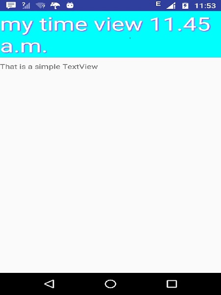
Let's try to run your myapplication application. I assume you had created your AVD while doing environment setup. To run the app from Android Studio, open one of your project's activity files and click Run  icon from the toolbar. Android Studio installs the app on your AVD and starts it and if everything is fine with your setup and application, it will display following Emulator window −
icon from the toolbar. Android Studio installs the app on your AVD and starts it and if everything is fine with your setup and application, it will display following Emulator window −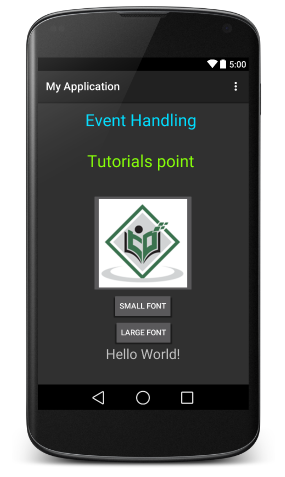
Now you try to click on two buttons, one by one and you will see that font of the Hello World text will change, which happens because registered click event handler method is being called against each click event.
Exercise
I will recommend to try writing different event handlers for different event types and understand exact difference in different event types and their handling. Events related to menu, spinner, pickers widgets are little different but they are also based on the same concepts as explained above.
A style resource defines the format and look for a UI. A style can be applied to an individual View (from within a layout file) or to an entire Activity or application (from within the manifest file).
Defining Styles
A style is defined in an XML resource that is separate from the XML that specifies the layout. This XML file resides under res/values/ directory of your project and will have <resources>as the root node which is mandatory for the style file. The name of the XML file is arbitrary, but it must use the .xml extension.
You can define multiple styles per file using <style> tag but each style will have its name that uniquely identifies the style. Android style attributes are set using <item> tag as shown below −
<?xml version="1.0" encoding="utf-8"?>
<resources>
   <style name="CustomFontStyle">
      <item name="android:layout_width">fill_parent</item>
      <item name="android:layout_height">wrap_content</item>
      <item name="android:capitalize">characters</item>
      <item name="android:typeface">monospace</item>
      <item name="android:textSize">12pt</item>
      <item name="android:textColor">#00FF00</item>/>
   </style>
</resources>
The value for the <item> can be a keyword string, a hex color, a reference to another resource type, or other value depending on the style property.
Using Styles
Once your style is defined, you can use it in your XML Layout file using style attribute as follows −
<?xml version="1.0" encoding="utf-8"?>
<LinearLayout xmlns:android="http://schemas.android.com/apk/res/android"
   android:layout_width="fill_parent"
   android:layout_height="fill_parent"
   android:orientation="vertical" >

   <TextView
      android:id="@+id/text_id"
      style="@style/CustomFontStyle"
      android:text="@string/hello_world" />

</LinearLayout>
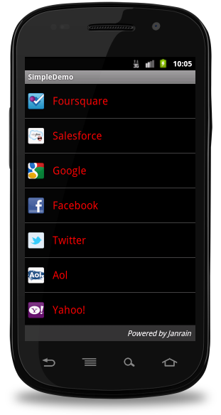
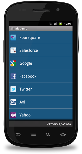
To understand the concept related to Android Style, you can check Style Demo Example.
Style Inheritance
Android supports style Inheritance in very much similar way as cascading style sheet in web design. You can use this to inherit properties from an existing style and then define only the properties that you want to change or add.
To implement a custom theme create or edit MyAndroidApp/res/values/themes.xml and add the following −
<resources>
   ...
   <style name="MyCustomTheme" parent="android:style/Theme">
   <item name="android:textColorPrimary">#ffff0000</item>
   </style>
   ...
</resources>
In your AndroidManifest.xml apply the theme to the activities you want to style −
<activity
   android:name="com.myapp.MyActivity"
   ...
   android:theme="@style/MyCustomTheme"
   />
Your new theme will be applied to your activity, and text is now bright red.
Applying Colors to Theme Attributes
Your color resource can then be applied to some theme attributes, such as the window background and the primary text color, by adding - elements to your custom theme. These attributes are defined in your styles.xml file. For example, to apply the custom color to the window background, add the following two
- elements to your custom theme, defined in MyAndroidApp/res/values/styles.xml file −
<resources>
   ...
   <style name="MyCustomTheme" ...>
      <item name="android:windowBackground">@color/my_custom_color</item>
      <item name="android:colorBackgroundCacheHint">@color/my_custom_color</item>
   </style>
   ...
</resources>
Using a Custom Nine-Patch With Buttons
A nine-patch drawable is a special kind of image which can be scaled in width and height while maintaining its visual integrity. Nine-patches are the most common way to specify the appearance of Android buttons, though any drawable type can be used.

A SAMPLE OF NINE-PATCH BUTTON
Steps to create Nine-Patch Buttons
- Save this bitmap as /res/drawable/my_nine_patch.9.png
- Define a new style
- Apply the new button style to the buttonStyle attribute of your custom theme
DEFINE A NEW STYLE
<resources>
   ...
      <style name="MyCustomButton" parent="android:Widget.Button">
      <item name="android:background">@drawable/my_nine_patch</item>
      </style>
   ...
</resources>
APPLY THE THEME
<resources>
   ...
      <style name="MyCustomTheme" parent=...>
         ...
         <item name="android:buttonStyle">@style/MyCustomButton</item>
      </style>
   ...
</resources>
Android Themes
Hope you understood the concept of Style, so now let's try to understand what is a Theme. A theme is nothing but an Android style applied to an entire Activity or application, rather than an individual View.
Thus, when a style is applied as a theme, every View in the Activity or application will apply each style property that it supports. For example, you can apply the sameCustomFontStyle style as a theme for an Activity and then all text inside that Activity will have green monospace font.
To set a theme for all the activities of your application, open the AndroidManifest.xml file and edit the <application> tag to include the android:theme attribute with the style name. For example −
<application android:theme="@style/CustomFontStyle">
But if you want a theme applied to just one Activity in your application, then add the android:theme attribute to the <activity> tag only. For example −
<activity android:theme="@style/CustomFontStyle">
There are number of default themes defined by Android which you can use directly or inherit them using parent attribute as follows −
<style name="CustomTheme" parent="android:Theme.Light">
   ...
</style>
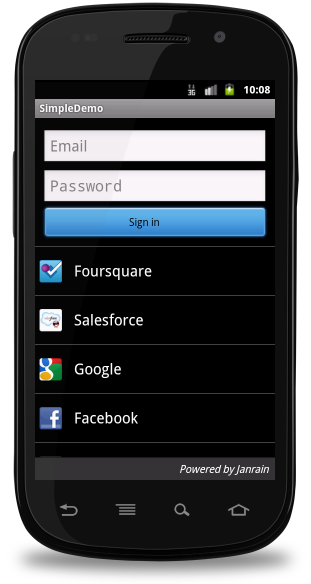
To understand the concept related to Android Theme, you can check Theme Demo Example.
Styling the colour palette
The layout design can implementable based on them based colours, for example as following design is designed based on them colour(blue)
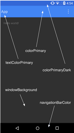
Above layout has designed based on style.xml file,Which has placed at res/values/
<resource>
   <style name="AppTheme" parent="android:Theme.Material">
      <item name ="android:color/primary">@color/primary</item>
      <item name ="android:color/primaryDark">@color/primary_dark</item>
      <item name ="android:colorAccent/primary">@color/accent</item>
   </style>
<resource>
Default Styles & Themes
The Android platform provides a large collection of styles and themes that you can use in your applications. You can find a reference of all available styles in the R.style class. To use the styles listed here, replace all underscores in the style name with a period. For example, you can apply the Theme_NoTitleBar theme with "@android:style/Theme.NoTitleBar". You can see the following source code for Android styles and themes −
Implementing own components in pre built-in components with extending subclass with own defined class
Android offers a great list of pre-built widgets like Button, TextView, EditText, ListView, CheckBox, RadioButton, Gallery, Spinner, AutoCompleteTextView etc. which you can use directly in your Android application development, but there may be a situation when you are not satisfied with existing functionality of any of the available widgets. Android provides you with means of creating your own custom components which you can customized to suit your needs.
If you only need to make small adjustments to an existing widget or layout, you can simply subclass the widget or layout and override its methods which will give you precise control over the appearance and function of a screen element.
This tutorial explains you how to create custom Views and use them in your application using simple and easy steps.
EXAMPLE OF CUSTOM COMPONENTS IN CUSTOM VIEW HIERARCHY
Creating a Simple Custom Component
| Step | Description |
|---|---|
| 1 | You will use Android studio IDE to create an Android application and name it ascompoundview under a package com.vogella.android.customview.compoundviewas explained in the Hello World Example chapter. |
| 2 | Create an XML res/values/attrs.xml file to define new attributes along with their data type. |
| 3 | Create src/ColorOptionsView.java file and add the code to define your custom component. It will extend LinearLayout and will have additional functionality to show colour compound . You will provide attributes parsing logic in of the constructors having AttributeSet as a parameter. |
| 4 | Modify res/layout/activity_main.xml file and add the code to create Colour compound view instance along with few default attributes and new attributes. |
| 5 | Run the application to launch Android emulator and verify the result of the changes done in the application. |
Create the following attributes file called attrs.xml in your res/values folder.
<?xml version="1.0" encoding="utf-8"?>
<resources>
   <declare-styleable name="Options">
      <attr name="titleText" format="string" localization="suggested" />
      <attr name="valueColor" format="color" />
   </declare-styleable>
</resources>
Change the layout file used by the activity to the following.
<LinearLayout xmlns:android="http://schemas.android.com/apk/res/android"
   xmlns:tools="http://schemas.android.com/tools"
   xmlns:custom="http://schemas.android.com/apk/res/com.vogella.android.view.compoundview"
   android:layout_width="match_parent"
   android:layout_height="match_parent"
   android:orientation="vertical"
   android:showDividers="middle"
   android:divider="?android:attr/listDivider"
   tools:context=".MainActivity" >

   <com.vogella.android.view.compoundview.ColorOptionsView
      android:id="@+id/view1"
      android:layout_width="match_parent"
      android:layout_height="?android:attr/listPreferredItemHeight"
      android:background="?android:selectableItemBackground"
      android:onClick="onClicked"
      custom:titleText="Background color"
      custom:valueColor="@android:color/holo_green_light"/>

   <com.vogella.android.view.compoundview.ColorOptionsView
      android:id="@+id/view2"
      android:layout_width="match_parent"
      android:layout_height="?android:attr/listPreferredItemHeight"
      android:background="?android:selectableItemBackground"
      android:onClick="onClicked"
      custom:titleText="Foreground color"
      custom:valueColor="@android:color/holo_orange_dark"/>

</LinearLayout>
Create the following java file called ColorOptionsView for your compound view.
package com.vogella.android.customview.compoundview;

import com.vogella.android.view.compoundview.R;

import android.content.Context;
import android.content.res.TypedArray;
import android.util.AttributeSet;
import android.view.Gravity;
import android.view.LayoutInflater;
import android.view.View;
import android.widget.ImageView;
import android.widget.LinearLayout;
import android.widget.TextView;

public class ColorOptionsView extends LinearLayout {
   private View mValue;
   private ImageView mImage;

   public ColorOptionsView(Context context, AttributeSet attrs) {
      super(context, attrs);

      TypedArray a = context.obtainStyledAttributes(attrs,R.styleable.ColorOptionsView, 0, 0);
      String titleText = a.getString(R.styleable.ColorOptionsView_titleText);

      int valueColor = a.getColor(R.styleable.ColorOptionsView_valueColor,android.R.color.holo_blue_light);
      a.recycle();

      setOrientation(LinearLayout.HORIZONTAL);
      setGravity(Gravity.CENTER_VERTICAL);

      LayoutInflater inflater = (LayoutInflater) context.getSystemService(Context.LAYOUT_INFLATER_SERVICE);
      inflater.inflate(R.layout.view_color_options, this, true);
      TextView title = (TextView) getChildAt(0);
      title.setText(titleText);

      mValue = getChildAt(1);
      mValue.setBackgroundColor(valueColor);
      mImage = (ImageView) getChildAt(2);
   }

   public ColorOptionsView(Context context) {
      this(context, null);
   }

   public void setValueColor(int color) {
      mValue.setBackgroundColor(color);
   }

   public void setImageVisible(boolean visible) {
      mImage.setVisibility(visible ? View.VISIBLE : View.GONE);
   }
}
Change your Main activity java file to the following code and run your application.
package com.vogella.android.customview.compoundview;

import com.vogella.android.view.compoundview.R;

import android.app.Activity;
import android.os.Bundle;
import android.view.Menu;
import android.view.View;
import android.widget.Toast;

public class MainActivity extends Activity {
   @Override
   protected void onCreate(Bundle savedInstanceState) {
      super.onCreate(savedInstanceState);
      setContentView(R.layout.activity_main);
   }

   @Override
   public boolean onCreateOptionsMenu(Menu menu) {
      // Inflate the menu; this adds items to the action bar if it is present.
      getMenuInflater().inflate(R.menu.activity_main, menu);
      return true;
   }

   public void onClicked(View view) {
      String text = view.getId() == R.id.view1 ? "Background" : "Foreground";
      Toast.makeText(this, text, Toast.LENGTH_SHORT).show();
   }
}
The running application should look like the following screen shot.
Instantiate using code inside activity class
It is very similar way of instantiating custom component the way you instantiate built-in widget in your activity class. For example you can use following code to instantiate above defined custom component −
@Override
protected void onCreate(Bundle savedInstanceState) {
   super.onCreate(savedInstanceState);
   setContentView(R.layout.activity_main);

   DateView dateView = new DateView(this);
   setContentView(dateView);
}
Check Above example to understand how to Instantiate a Basic Android Custom Component using code inside an activity.
Instantiate using Layout XML file
Traditionally you use Layout XML file to instantiate your built-in widgets, same concept will apply on your custom widgets as well so you will be able to instantiate your custom component using Layout XML file as explained below. Here com.example.compoundviewis the package where you have put all the code related to DateView class and DateView is Java class name where you have put complete logic of your custom component.
<RelativeLayout xmlns:android="http://schemas.android.com/apk/res/android"
   xmlns:tools="http://schemas.android.com/tools"
   android:layout_width="match_parent"
   android:layout_height="match_parent"
   android:paddingBottom="@dimen/activity_vertical_margin"
   android:paddingLeft="@dimen/activity_horizontal_margin"
   android:paddingRight="@dimen/activity_horizontal_margin"
   android:paddingTop="@dimen/activity_vertical_margin"
   tools:context=".MainActivity" >

   <com.example.compoundview.DateView
      android:layout_width="match_parent"
      android:layout_height="wrap_content"
      android:textColor="#fff"
      android:textSize="40sp"
      android:background="#000"/>
</RelativeLayout>
It is important to note here that we are using all TextView attributes along with custom component without any change. Similar way you will be able to use all the events, and methods along with DateView component.
Check this example to understand how to Instantiate a Basic Android Custom Component using Layout XML file.
Custom Component with Custom Attributes
We have seen how we can extend functionality of built-in widgets but in both the examples given above we saw that extended component can make use of all the default attributes of its parent class. But consider a situation when you want to create your own attribute from scratch. Below is a simple procedure to create and use new attributes for Android Custom components. Consider we want to introduce three attributes and will use them as shown below −
<com.example.compoundview.DateView
   android:layout_width="match_parent"
   android:layout_height="wrap_content"
   android:textColor="#fff"
   android:textSize="40sp"
   custom:delimiter="-"
   custom:fancyText="true"/>
Step 1
The first step to enable us to use our custom attributes is to define them in a new xml file under res/values/ and call it attrs.xml. Let's have a look on an example attrs.xml file −
<?xml version="1.0" encoding="utf-8"?>
<resources>
   <declare-styleable name="DateView">
   <attr name="delimiter" format="string"/>
   <attr name="fancyText" format="boolean"/>
   </declare-styleable>
</resources>
Here the name=value is what we want to use in our Layout XML file as attribute, and theformat=type is the type of attribute.
Step 2
Your second step will be to read these attributes from Layout XML file and set them for the component. This logic will go in the constructors that get passed an AttributeSet, since that is what contains the XML attributes. To read the values in the XML, you need to first create aTypedArray from the AttributeSet, then use that to read and set the values as shown in the below example code −
TypedArray a = context.obtainStyledAttributes(attrs, R.styleable.DateView);

final int N = a.getIndexCount();
for (int i = 0; i < N; ++i)
{
   int attr = a.getIndex(i);
   switch (attr)
   {
      case R.styleable.DateView_delimiter:
      String delimiter = a.getString(attr);

      //...do something with delimiter...
      break;

      case R.styleable.DateView_fancyText:
      boolean fancyText = a.getBoolean(attr, false);

      //...do something with fancyText...
      break;
   }
}
a.recycle();
Step 3
Finally you can use your defined attributes in your Layout XML file as follows −
<RelativeLayout xmlns:android="http://schemas.android.com/apk/res/android"
   xmlns:tools="http://schemas.android.com/tools"
   xmlns:custom="http://schemas.android.com/apk/res/com.example.compoundview"
   android:layout_width="match_parent"
   android:layout_height="match_parent"
   android:paddingBottom="@dimen/activity_vertical_margin"
   android:paddingLeft="@dimen/activity_horizontal_margin"
   android:paddingRight="@dimen/activity_horizontal_margin"
   android:paddingTop="@dimen/activity_vertical_margin"
   tools:context=".MainActivity" >

   <com.example.compoundview.DateView
      android:layout_width="match_parent"
      android:layout_height="wrap_content"
      android:textColor="#fff"
      android:textSize="40sp"
      custom:delimiter="-"
      custom:fancyText="true"/>

</RelativeLayout>
The important part is xmlns:custom="http://schemas.android.com/apk/res/com.example.compoundview". Note that http://schemas.android.com/apk/res/ will remain as is, but last part will be set to your package name and also that you can use anything after xmlns:, in this example I used custom, but you could use any name you like.
Check this example to understand how to Create Custom Attributes for Android Custom Component with simple steps.


No comments:
Post a Comment